Pages

Monday, January 29, 2018

3 sketchbook journals - "In Bloom", "Language" and "Uncomfortable Zone"


It's time for me to start creating in a new sketchbook journal. Instead of creating in one at a time, I decided to work in three at once. 

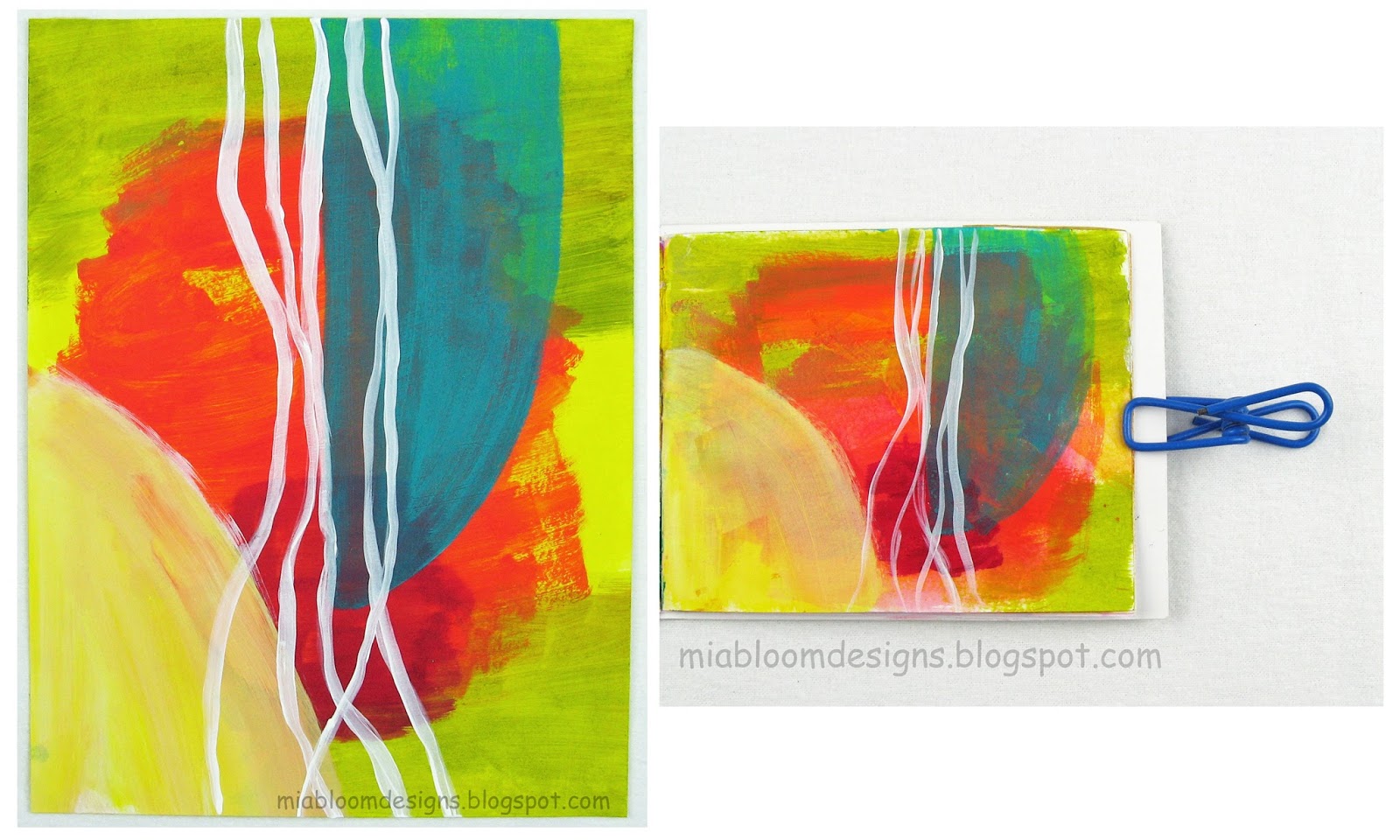
"In Bloom" is another book made using collaged card stock like "Time For Tea". It's 4.5" x 5.5". Instead of watercolor paper like "Time For Tea", it's made with cut up magazine pages as the signatures. I will use this sketchbook journal to create small paper collages.

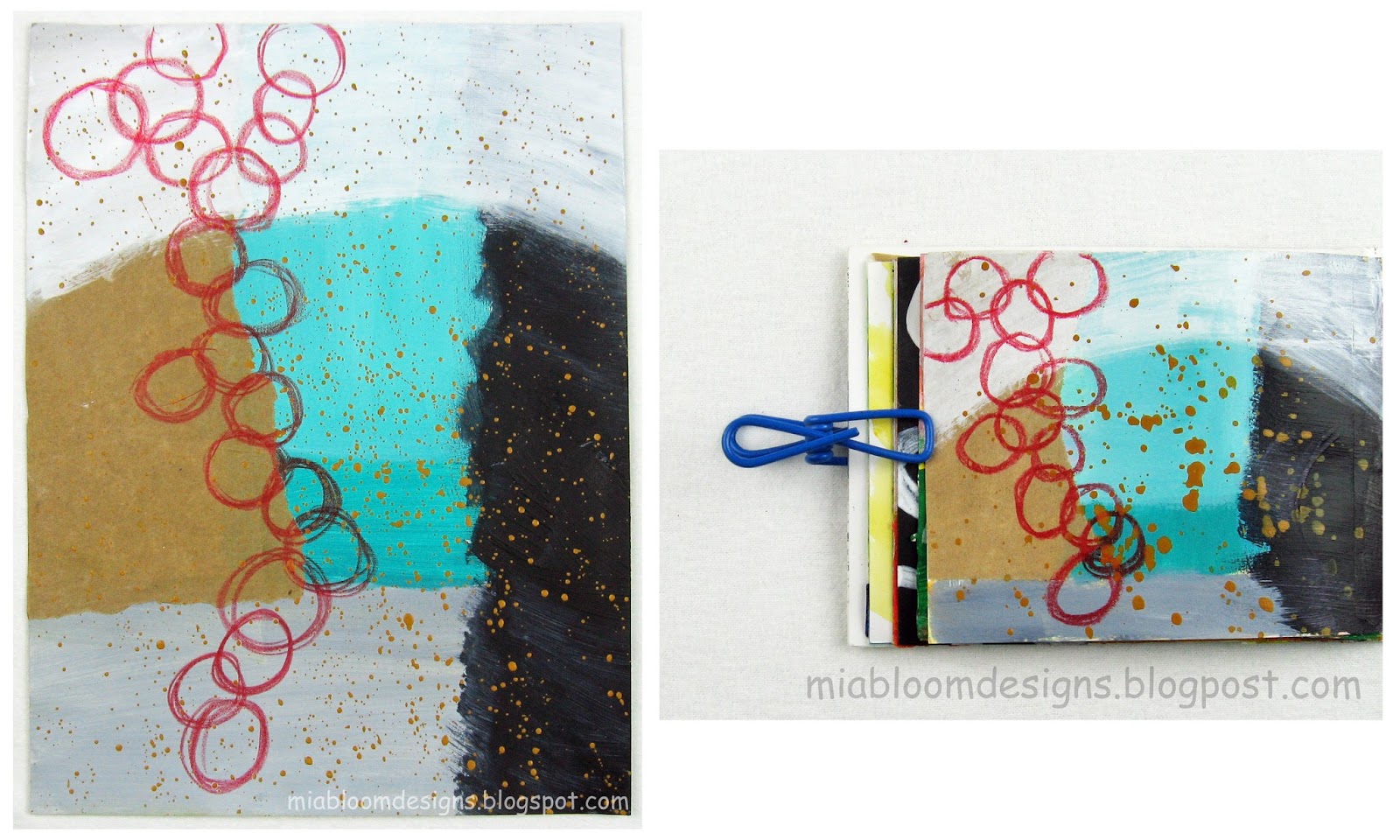
"Language" is an altered book that has monoprinted watercolor paper in various sizes. This one will be use to create sketches using words or sayings as a prompt.

"Uncomfortable Zone" is a 5" square book made of primed canvas.The story behind the title of this book has to do my goal to work outside my comfort zone. Creating on this material will allow me to add many layers of paint and pen marks. I'm uncomfortable adding layer upon layer in my art. I usually create in an uncluttered style. Let's see how it goes.
 
Thanks for checking out my blog!

Friday, January 26, 2018

little red book


little red book - 4" square

little red book - spine showing Coptic stitch


This little red book is an example of making lemonade from lemons. 

I wanted to try eco-printing so one Saturday I cut up some heavy drawing paper, picked leaves and flowers then got to work. After 1/2 a day, I realized that it wasn't working. The images of the leaves and flowers were not being transferred to the paper. I found that I was using the wrong mordant. Instead of throwing the bundle out, I decided to dye it. I placed one end into a vat of red dye and let it sit for 3 hours then placed the other end in dark green dye for the same amount of time. The leaves and flowers acted as a resist. I very happy with the results and will use this technique again.

little red book - front cover

little red book - inside front cover + first signature

little red book - end of first and beginning of second signature

little red book - second signature

little red book - end of third and beginning of fourth signature

little red book - fourth signature

little red book - back cover


Thanks for checking out my blog! 

Monday, January 22, 2018

Time For Tea sketches revisited

After finishing my Time For Tea sketchbook journal, I decided to take another look at all the sketches. As I was looking at the sketches, I had a feeling that this project wasn't completely finished. The sketchbook journal is definitely finished because all the pages are marked. The sketches, on the other hand, may have some more life in them. I thought it would be a good exercise to enlarge some of the more successful sketches to 9"x12". Some of the sketches translated to this size and some not so much. Sketch #22 9"x12" looks a bit pointy, which isn't pleasing to my eye. All in all, it was a great exercise.

sketch #5 - 9"x12" abstract and 4"x5" original


sketch #10 - 9"x12" abstract and 4"x5" original


sketch #11 - 9"x12" abstract and 4"x5" original


sketch #14 - 9"x12" abstract and 4"x5" original


sketch #19 - 9"x12" abstract and 4"x5" original


sketch #20 - 9"x12" abstract and 4"x5" original


sketch #22 - 9"x12" abstract and 4"x5" original


sketch #23 - 9"x12" abstract and 4"x5" original


Thanks for checking out my blog!

Friday, January 5, 2018

Time For Tea - mini sketchbook journal final sketches

My Time For Tea mini (4.5" x 5.5") sketchbook journal is completely filled with sketches. The final four sketches are pictured below. This book was one of the first books I made while teaching myself to book bind. I should mention that I'm continuing to practice book binding. It's an ongoing and inspiring new practice for me. To read about the start of my book binding journey, please click here. To see the sketches from my previous blog posts, please click here.

This sketch was quickly made one night using acrylic paint and paper from magazines. I've never been comfortable using complementary colors or specifically, split complementary colors - purple, yellow and orange. It seems a bit jarring visually to me but I want to continue to use these types of color combinations to expand my use of different color palettes.


Another quick sketch using split complementary colors. To me, these colors aren't as jarring visually as the sketch above. I'm happy with the use of red color pencil that I scribbled over the second layer of acrylic paint.The acid green elements are torn monoprinted deli papers. Love the transparency effect. The last layer is white acrylic used as a veil.


I used leftover acrylic paint for this sketch. Again using color pencil to add another element. All in all I'm happy with the way this sketch turned out.


I started this sketch by applying a light wash of white acrylic paint over the watercolor that was on the paper. Then I stared at the white page for quite some time. I couldn't think of a sketch idea that used acrylic paint. It was getting late so I grabbed 3 pieces of paper from a magazine and glued them down then used a lavender Sharpie to draw the surrounding dots. This sketch is in my comfort zone of simple, abstract collages.


This collage above is the last sketch in this sketchbook journal. It's been a fantastic learning experience working in one sketchbook journal over 6 weeks. Restricting myself to create in a small (4.5" x 5.5") size was a challenge some days and other times a relief. Also, the watercolor paper limited the amount of layers of paint I could apply. I need to decide if I'm going to start working in one or multiple sketchbook journals next.


Thanks for checking out my blog!